FoodSpot
Reusable Structures, Dynamic Styles
Introduction
For the "FoodSpot" project, I was tasked with recreating a website design from a static image. This meant I had to interpret the visual layout and translate it into flexible, reusable HTML and CSS structures. This project was a valuable exercise in understanding how to build adaptable web designs from a single visual reference.
Translating Static Design into Reusable HTML
The initial challenge was to analyse the static image and identify recurring patterns and components. To achieve this, I focused on creating semantic and modular HTML:
-
Consistent Section Structure: Each
<section>was designed to be self-contained and adaptable. -
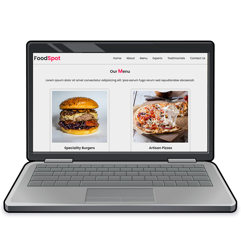
Card-Based Layout: The recurring card pattern
(using
<div class="card">) was implemented to display menu items, expert profiles, and testimonials. This consistency in HTML structure was crucial for reusability. -
Image Wrappers: I used
<div>elements with classes likeimg-square,img-portrait, andimg-roundto handle the varying image shapes seen in the design, ensuring flexibility in how images were displayed. - Navigation: The menu was written to be a standard nav bar, but with the addition of a small amount of JavaScript, and CSS media queries, it was also able to be used as a drop-down menu on mobile devices.
This approach allowed me to create a lean and maintainable HTML structure that could be styled differently to match the static design's varied visual elements.
CSS:
Adapting Reusable Structures to Visual Design
The CSS was then used to transform these reusable HTML structures into the distinct visual sections seen in the static image:
-
Image Styling: The
img-*classes were styled to create the different image shapes and sizes, directly replicating the visual design. - Card Layout: Flexbox was used to create responsive card grids that adapted to different screen sizes, ensuring the design remained consistent across devices.
- Section-Specific Styles: The "Testimonials" section, for instance, used the same card structure as the "Menu" but was styled with a different background and text styles to match the static design.
- Responsive Design: Media queries were used to adjust the layout and styling for smaller screens, ensuring the website looked good on all devices.
Key Takeaways
This project was a valuable learning experience in translating a static design into a dynamic, reusable website structure, emphasising the importance of adaptable HTML and CSS in web development:
- Visual Interpretation: Working from a static image required careful interpretation of the design to create flexible HTML structures.
- HTML Reusability: Designing HTML with reusable components reduced code duplication and improved maintainability.
- CSS Adaptability: CSS was used to adapt the reusable HTML structures to match the specific visual requirements of each section.
- Responsive Design: Using flexbox and media queries ensured that the website adapted to different screen sizes.
- Modular Design: The card-based layout demonstrated the power of modular design, where reusable components can be styled differently for varied purposes.
Conclusion
This project was a valuable learning experience in translating a static design into a dynamic, reusable website structure, emphasising the importance of adaptable HTML and CSS in web development.

